Project 2- Notan Shaving Cream Ad, Part II
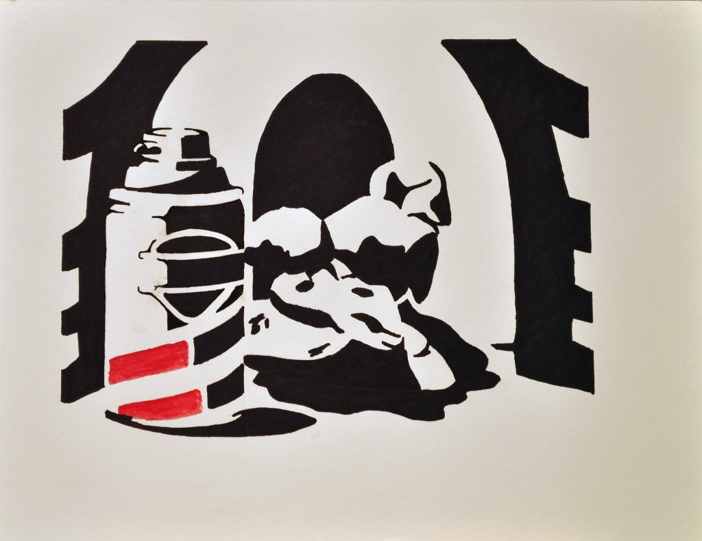
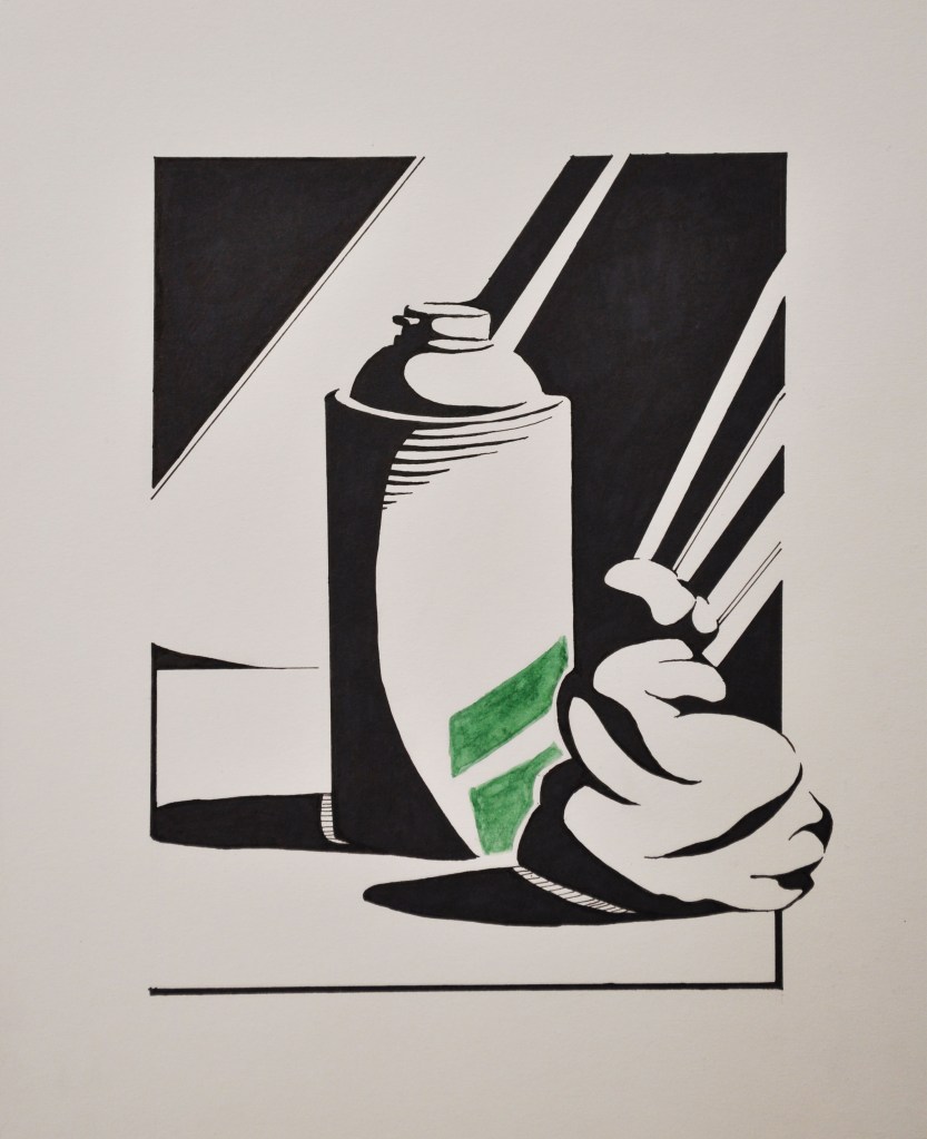
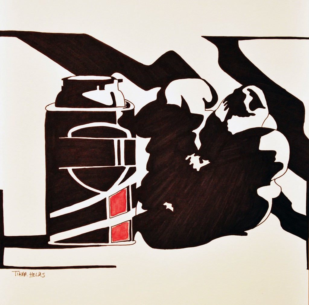
Today we will continue with Project 2- Notan Shaving Cream Ad. I will go over some design choices and techniques; balancing the elements of the design; The border design; How to create an interesting background that highlights the elements; How the border and the background design interface with each other. We will cover the watercoloring of the stripes of the can in the next lesson in order to complete the image. I have included examples from previous students of Drawing II.
We will continue working on Project 2- Notan Shaving Cream Ad.
Materials:
- Project 2- on the multi-media paper, 11 x 14
- Microns
- Black marker, wide, Sharpie (or what is available)
- These stripes (which will be watercolored) must have a white line between them and the black marker.
- ATTENTION: depending on the black marker that you use, it will run if you get it wet with water. Do not go over the black marker with the watercolor.
Instructions:
- Look at the border- can you join this border with a part or segment of the composition?
- Create interest along the border- round edges, merge parts, break away from the forms.
- Make sure your stripes feel as though they spiral along the can- get the feel for the cross-contour curve.
- Create a white border around the colored area of the stripe- this can be narrow, but must be wide enough to discern. This white area will intensify the watercolor. Without it, your color will appear dull. So be careful here.
Upload to the assignment section.
Due: M/W Wednesday, March 3 before 11:59 AM.
T/TH Thursday, March 4 before 11:59 AM.
Secondly, Please watch the Video/questions, “Toned Paper”. Due: M/W Monday, March 1 before 11:59 AM. T/TH Tuesday, March 2 before 11:59 AM.
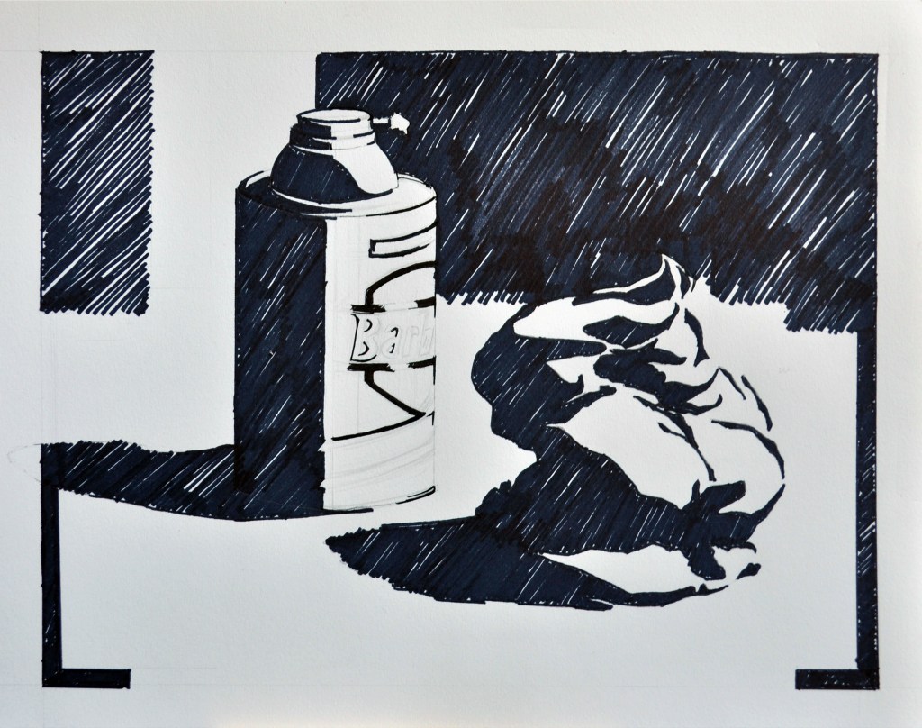
Student Examples