Project 3- Colored Object within a Monochrome Setting, Part III
This lesson is a continuation of Project 3. I would like you to use a 6B pencil and increase the contrast of the monochrome objects. You may wish to darken some of the shadow areas and sharpen some of the edges on the close objects. This is an opportunity to just tweak the contrast and give the image a feeling of completion. You may wish to use the Micron .03, fine point, to do the same. But do not overdue the Micron as this will flatten the forms.
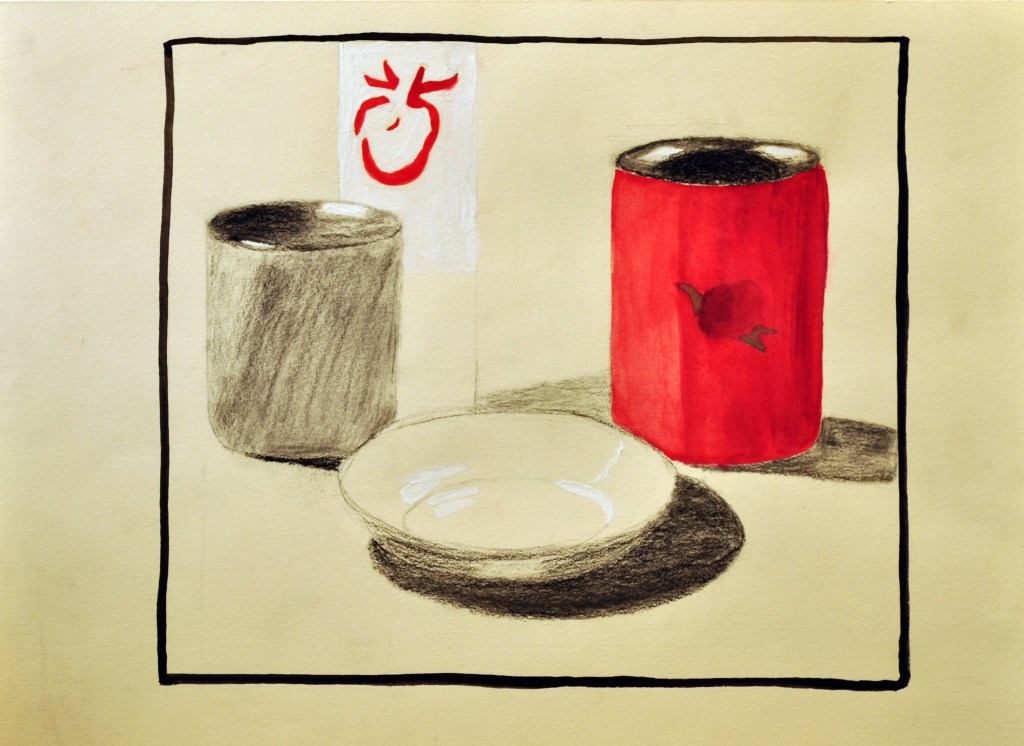
This lesson is to give you extra time to complete this piece. I have high expectations. Only hand in studied and completed work. Use your creativity to express the drama in this set-up, maintaining the colored object as the point of focus. Even though the other objects are monochrome, suppressing the focus on them, they should be rendered well. They should also, clearly point to the main object through the composition.
- The monochrome objects will be rendered in pencil only using the correct values and pencil techniques.
- The main object should be rendered in 3 colors or less (You can use the complements with an added color). These colors will react with one another to create a vital image. Do not add any additional colors as this will mute the effect of the triad or complementary colors that are part of the triad.
- You may wish to add some accents on the colored object only, with the smallest Micron. Do not over do this and you may find it unnecessary, as it may separate the colored object too much from its surroundings.
Materials
- 6B pencil
- Micron .03 (this has a very fine point) DO NOT OVERDO THIS. Only use it as an accent. In my example, I only use the 6B pencil to create my contrast. In past semesters, my students have used compressed charcoal to create the contrasting accents [Do not use charcoal on yours]. Whichever method you choose, 6B pencil or Micron .03, the composition should feel unified and complete, not broken up by various techniques.
Upload completed Project 3- “Colored Object within a Monochrome Setting”.
Due: Tuesday, March 23 before 11:59 AM.
Due: Monday, March 22 before 11:59 AM.

Student Examples