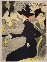
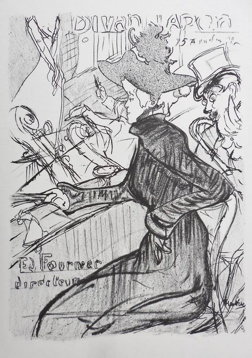
19th Century Poster Design- Artist Innovators and their Techniques
Printmaking and early Poster design of the 19th century sought to reach a wide audience of the emerging new middle class through advertising theater performances, cafes, new books and avant-garde art and dance. Artists explored new iconography in order to capture the attention of this audience. At this time, posters were printed on large stones. This method was called lithography. It came with inherent limitations and these limitations of the medium, set the tone for the type of designs that would become popular in mainstream culture. The limitation of materials produced innovative design efforts. Artists such as Toulouse Lautrec, Theophile Alexandre Steinlen and Jules Cheret captured this moment. Even today, we recognize their designs and you may even see cheap posters at Walmart or Michael’s with their images.
19th Century Poster Images: Module 2
Lithography had its limitations- the stones were limited in size- the larger the stone the heavier it was and harder to transport from the artist’s studio to the print shop. Secondly, each color that you added to the design need to be applied to a different stone with the “Key” stone presenting the black drawing. All these stones needed to be registered to align image, color, drawing and text. But limitation has its power- the limited range of color allowed these artists to use color to focus the eye and concentrate on the intent of the message. These colors, usually 3 or less, created the environment in which a simple bold statement of 1-3 colors created a base upon which a monochrome or muted tone upper drawing created contrast and visual excitement. Such brevity of technique allowed these posters to stand out and form an iconography of image, creating a new graphic vocabulary that influenced graphic design into the 20th and 21st century.
Learning to Use Watercolors
In this assignment, I would like you to create a color sheet demonstrating the types of mixes you can achieve with the watercolors that are in the kit. Please follow my schematic chart. This chart will present you with some choices to make. This chart will present you with some choices that you will need to mix. I will list the combinations I would like you to try. We will place our top line of colors in order- this will coincide with the light spectrum. Think of a rainbow. Even though every color has its inherent value, this will be something we can manipulate through the use of more or less water. We will never use the white unless I indicate to do so.
Materials
- 12 x 14 Multi-Media Pad
- Set of Watercolors
- #8 Watercolor Brush
- Container for water
- Paper towels
- Pencil to label colors and color mixes
Directions:
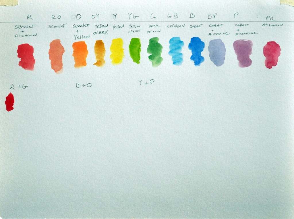
Follow along with the video to create your color chart. The top line is the order of color along the light spectrum. The order follows like this, 12 colors in order:
Step 1:
Red, Red orange, Orange, Orange-yellow, Yellow, Yellow-green, Green, Green-blue, Blue, Blue-purple, Purple, Purple-red.
Underlined colors are step 2. Below are the tubes of colors that you will use for the color indicated.
- Red orange: scarlet
- Orange yellow: yellow ochre
- Yellow: yellow
- Yellow green: yellow green
- Green: dark green
- Green blue: cerulean blue
- Blue: cobalt blue
- Purple red: alizarin crimson

Step 2:
These colors you need to mix and place them in the above row: Red, Orange, Blue-purple, Purple.
- Red: scarlet + alizarin crimson
- Orange: scarlet + yellow
- Blue purple: cobalt + alizarin
- Purple: cobalt + alizarin
Step 3:
Complements [These are colors that are opposite one another on the color wheel] Place each pure color under its name and then mix between them to see which colors you can make. Include the neutral, which is the brown or grey mix.
Red and Green Blue and Orange Yellow and Purple

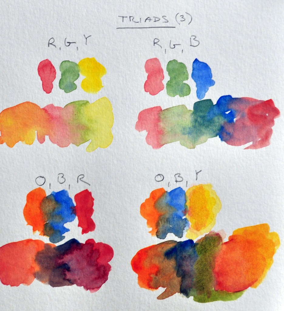
Step 4:
Triad Combinations which includes a complementary pair (these are underlined) and one other color. Try these Triads:
- Red, Green, Yellow
- Red, Green, Blue
- Orange, Blue, Red
- Orange, Blue, Yellow
- Purple, Yellow, Blue
- Purple, Yellow, Red
- There may be other triads that you may want to try

Neutrals:
- Burnt sienna
- Burnt umber
- Payne’s grey


