Project 2: Tonal Relationships Part II, Techniques
In this lesson we will cover some simple techniques to help us achieve the right balance between the tonal values of the 5 objects as a whole unit. Our goal is to bring all 5 objects, including the table and the background, into one harmonious unit that expresses each object’s middle value and its general value in relationship to the whole composition.
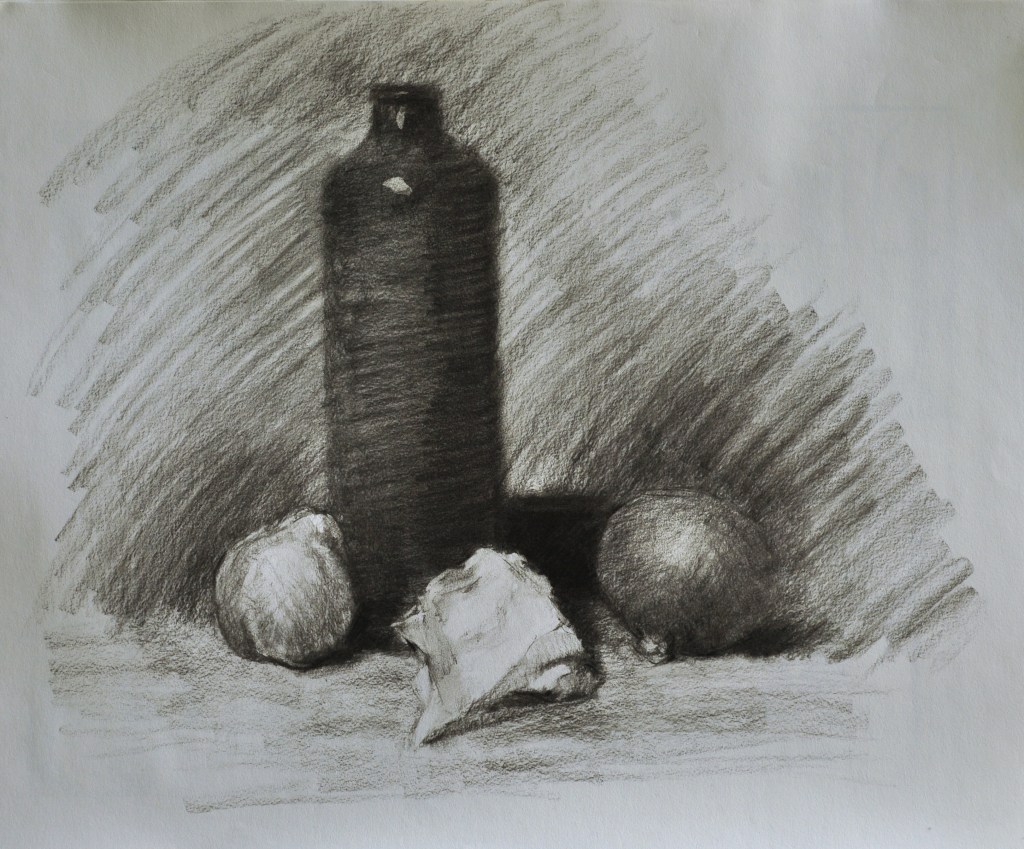
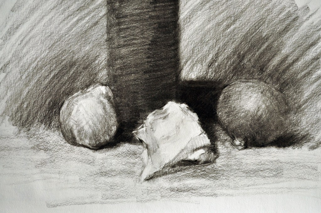
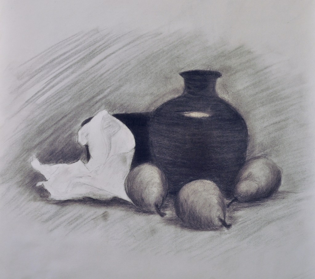
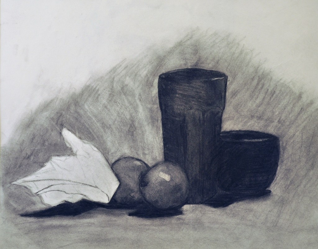
First we will begin by understanding the extremes in the composition. The black object will occupy the darkest value in the composition. The white object, a crumpled piece of copy paper, will occupy the lightest value. This white cannot be any lighter than the value of the drawing pad we are using. This is the lightest we can go. In order for this crumpled paper to radiate light, all the other objects in the composition will be darker than the paper.
The remaining objects, the 2 red apples and the lighter piece of fruit (orange) will occupy the values between our extremes. Neither will be black or white, but the middle value of our scale of values in this specific composition. You will need to decide which fruit is lighter than the other. The table top will also occupy this middle value range. Is the table top lighter than the apples? Is it darker than the orange?
Lastly, we have the background. What is nice about the background is that it will appear darker by a lighter object and the reverse, lighter by a darker object. Every artist takes advantage of this phenomena. So, I would recommend that you make the background darker by the white crumpled paper; lighter by the Black object; and either by the objects in the middle value range. This can be decided on a case by case basis. The objective is to heighten the 3-D quality and spatial movement around each object.
Assignment
Materials:
- 18 x 24 Project 2 Drawing
- Same supplies
Assignment: To use some of the techniques and strategies explained in the lesson and apply to your drawing, Project 2 “Tonal Relationships”.
Techniques to apply:
First we will begin by understanding the extremes in the composition. The black object will occupy the darkest value in the composition. The white object, a crumpled piece of copy paper, will occupy the lightest value. This white cannot be any lighter than the value of the drawing pad we are using. This is the lightest we can go. In order for this crumpled paper to radiate light, all the other objects in the composition will be darker than the paper.
The remaining objects, the 2 red apples and the lighter piece of fruit (orange) will occupy the values between our extremes. Neither will be black or white, but the middle value of our scale of values in this specific composition. You will need to decide which fruit is lighter than the other. The table top will also occupy this middle value range. Is the table top lighter than the apples? Is it darker than the orange?
Lastly, we have the background. What is nice about the background is that it will appear darker by a lighter object and the reverse, lighter by a darker object. Every artist takes advantage of this phenomena. So, I would recommend that you make the background darker by the white crumpled paper; lighter by the Black object; and either by the objects in the middle value range. This can be decided on a case by case basis. The objective is to heighten the 3-D quality and spatial movement around each object.
Charcoal techniques:
You may blend some areas using the stump blender. This can be helpful to unify a large area. I would recommend, if you use this technique, after you have blended an area, to then go back and stroke this area over again with the charcoal. This will add vitality to the surface. Do not use the stump on the background or the table top.
Vary the stroke of the charcoal– Begin with parallel diagonal lines to lay-in the initial middle value; then apply cross-contour lines to describe the form. Lastly, you can pull out a highlight with the kneaded eraser. You can darken the cast shadows that are on the table. You may wish to darken some of the outline, but no hard edges!
Paper-Pull out lights with the kneaded eraser. Make sure the pure white of the paper shows.
Background– Use parallel diagonal lines in the same direction to express the value of the background. This may be done with a vertical stroke or a diagonal stroke. DO NOT change the direction of the stroke. Keep it all the same.
Table top– Use a horizontal stroke in parallel lines to get the value correct. DO NOT change direction. The horizontal stroke will give the table solidity.
Upload photo of completed Project 2, “Tonal Relationships” to the assignment section.
T/TH, Due:
M/W, Due: